Rebrand · Web · Social
GEC Communities II
GEC works in sustainability. Their site presented everything the company knew, and visitors were leaving before they reached anything useful.
Goals
- Cut the amount of information so visitors stop bouncing
- Modernize a dated brand
- Fewer pages, which also meant less for the dev team to build
Challenges
- Most visitors give a site like this a few minutes at most
- The client iterated a lot on both colors and layout
- I was newer to UX and UI at the time
My role
- Rebrand: palette and a simplified logo
- Input on structure, led by our lead designer
- Full visual design, handed to the client's dev team to build
Background
GEC works in sustainability. Their site presented everything the company knew, and visitors were leaving before they reached anything useful. The graphics were dated on top of that.
The Challenge
Most people give a site like this a few minutes at most, and the old one asked for considerably more. Cutting it back meant deciding what the company could stop saying, which is a harder conversation than adding a page.
Approach
The brand
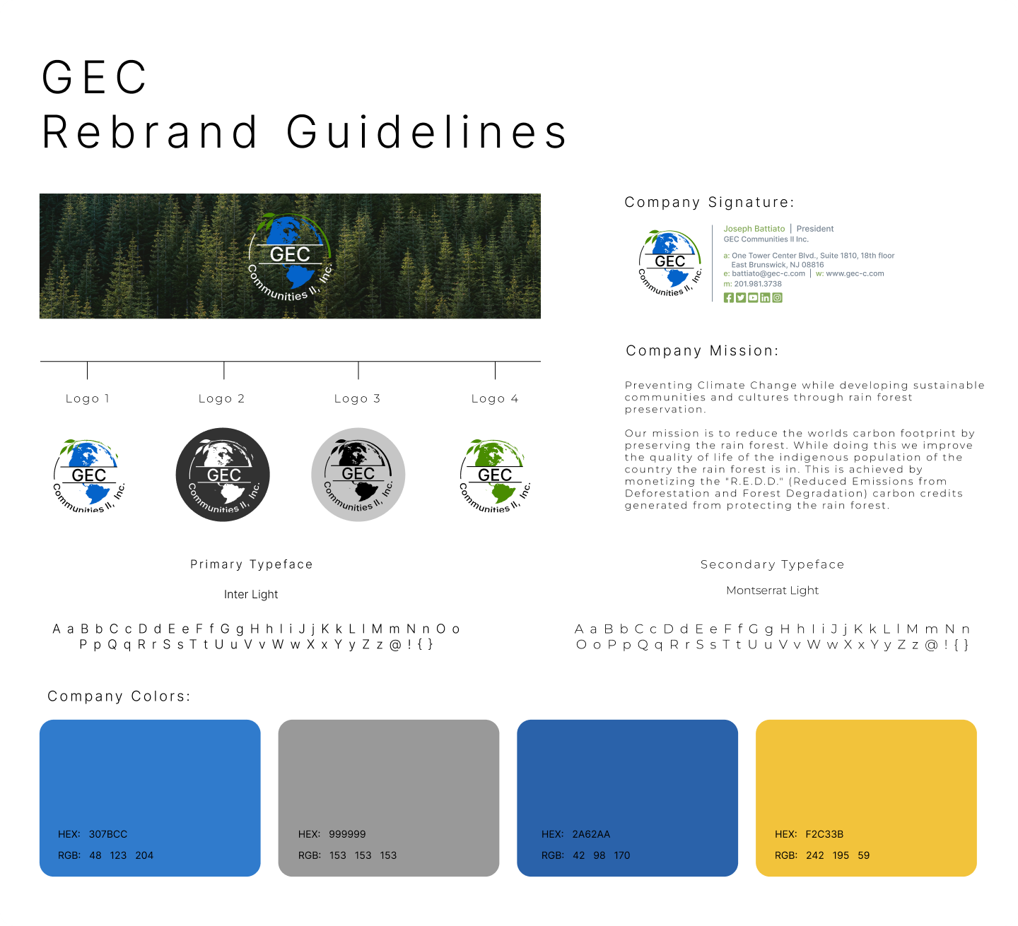
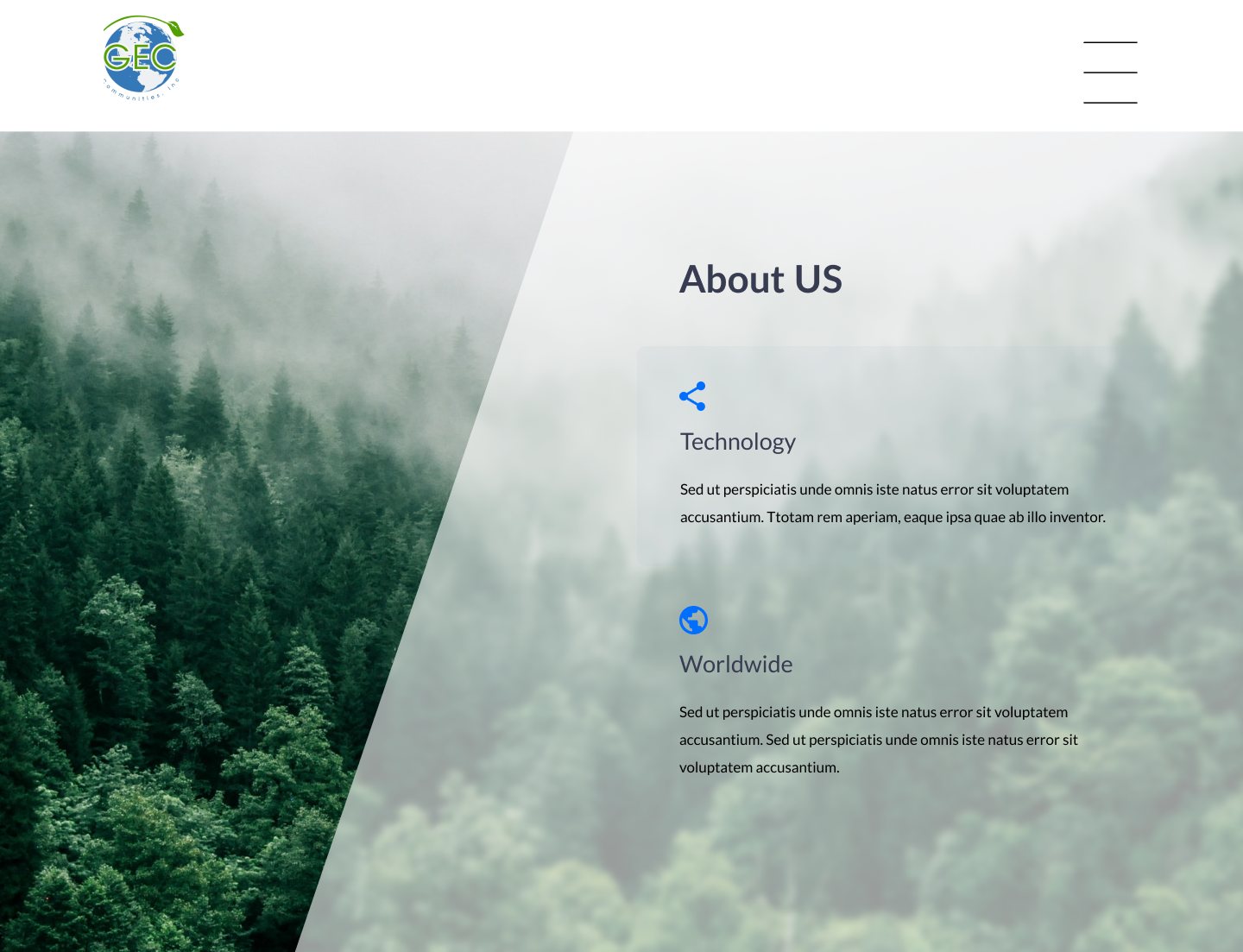
I rebuilt the brand first. The company’s focus is the environment and reducing carbon footprint. Green became the primary color, with blue and earthy accents alongside it. Simplifying the text graphics in the logo made it hold at small sizes.
The site
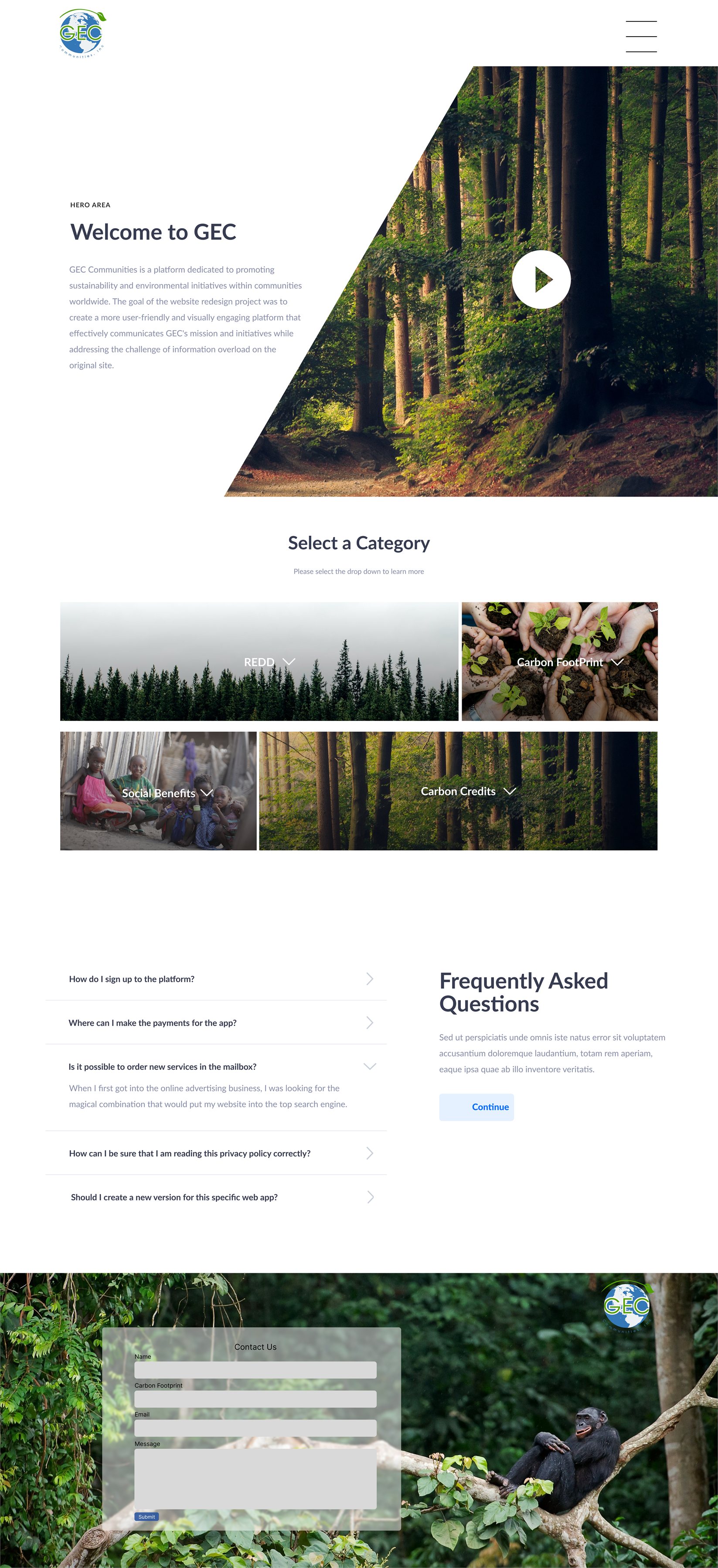
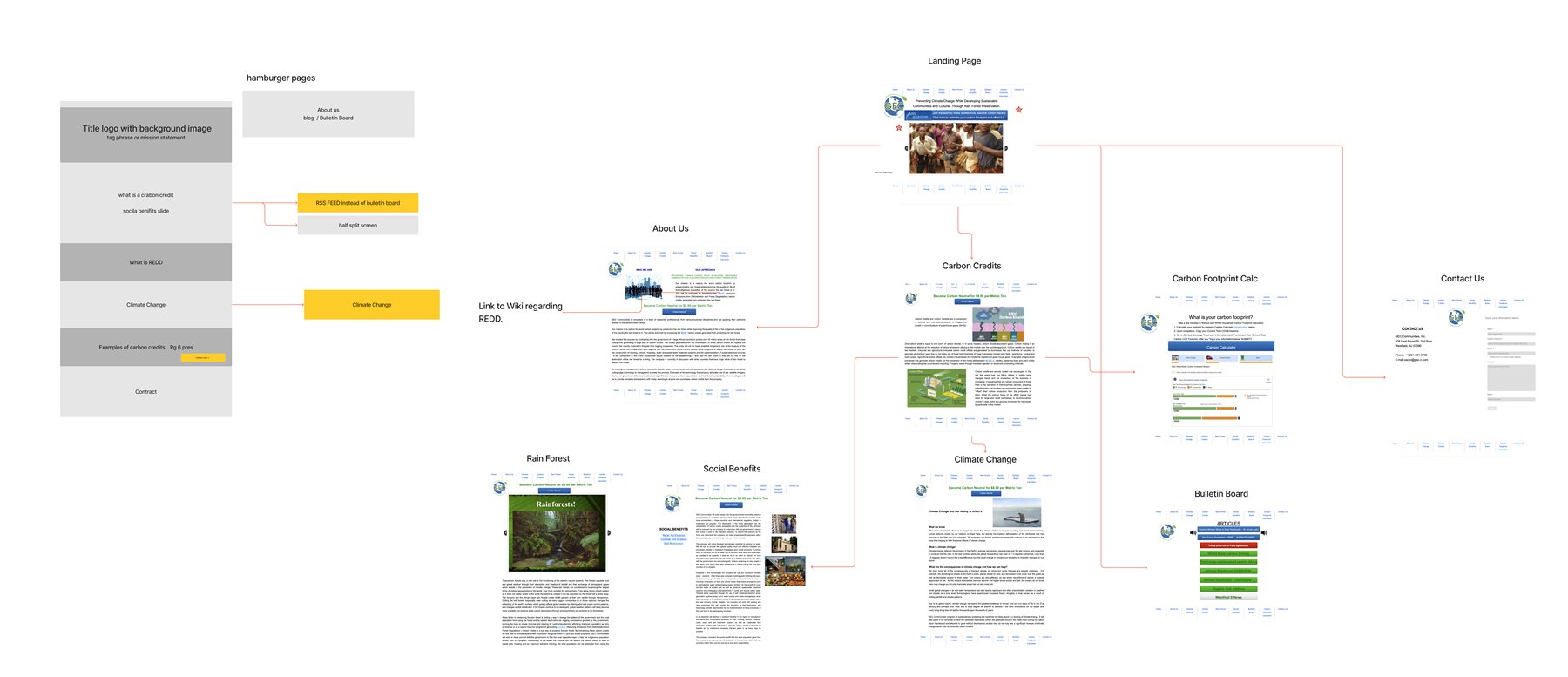
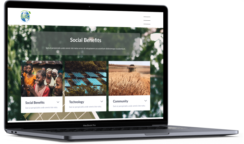
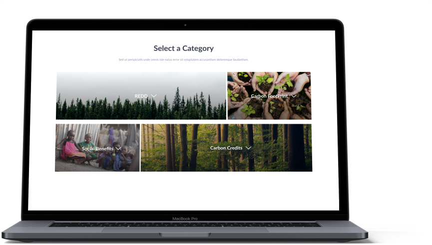
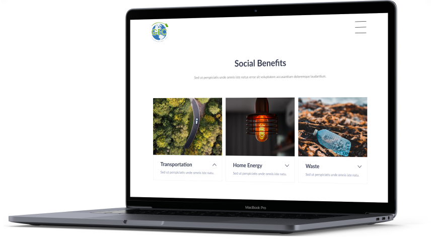
Most of the work was subtraction: fewer pages, shorter copy, and graphics carrying part of the explanation. Dropdown menus let visitors go deeper on their own terms while cutting the page count and reducing what the dev team had to build.
Looking back
Two things would have saved real time. Without a design system in place, every round of color changes meant working through each screen by hand. I also hadn’t learned auto layout yet, and the client iterated heavily on layout. Both are standard in how I work now.
Outcome
The client’s dev team built the site from my designs.